
Themes
Six looks. One click to switch between them.
Every website we build comes with all 6, and none of them costs anything. Each card below is drawn from the theme's own settings, so what you see is what a site gets.
Website themes
6 themes. One click to switch.
Pick one from your own portal and the whole site restyles — colours, typeface, corners, the shape of the header and footer, and whether anything moves at all. Your words never change. Each card below is drawn from the theme's own settings, so it is what you get.
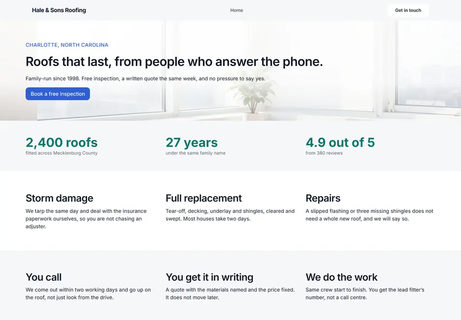
Aspen
Business and brand sites that need to launch fast
- Clean hero, services and call-to-action styles
- A light, warm palette that reads well in daylight
- Inter throughout — one typeface, nothing to wait for
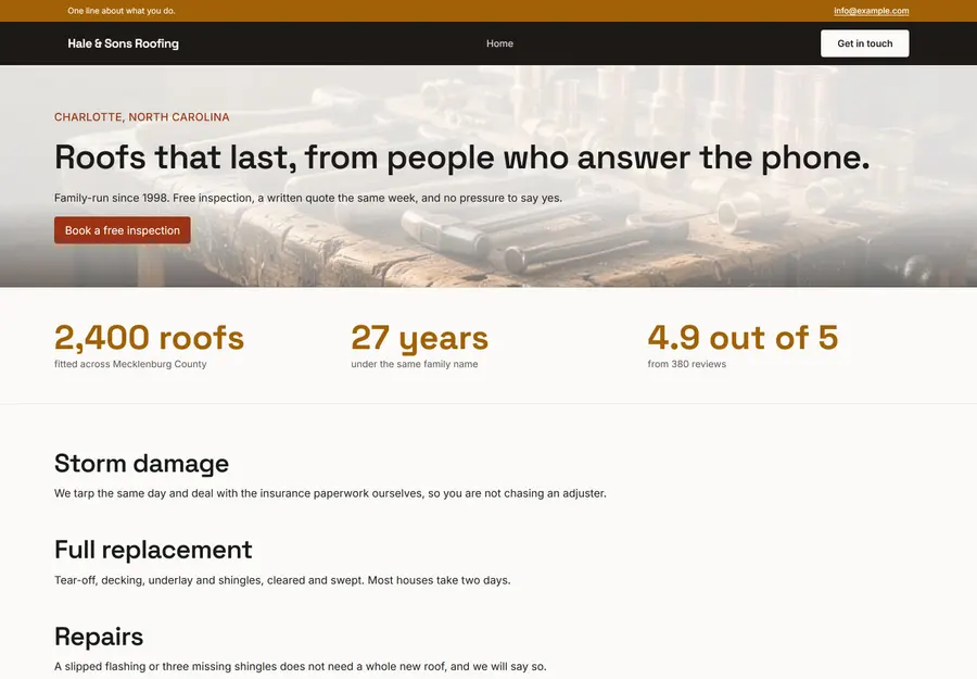
Cadence
Sites where the header and footer do the work — hours, a phone number, an address
- A dark header with a strip above it for the one fact people came for
- A footer that asks for the call rather than listing links
- Confident headings — a wider type scale than Aspen
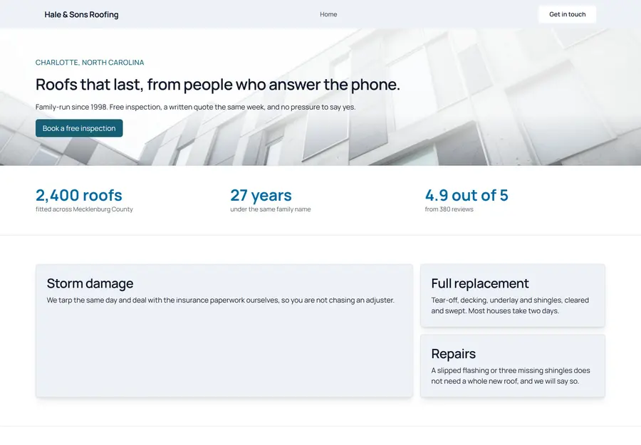
Mosaic
Businesses with a range to show — services, packages, a team
- Cards with a real shadow, so a page of them reads as a grid
- A cool, structured palette that keeps its edges
- Manrope throughout — even, modern, easy at small sizes
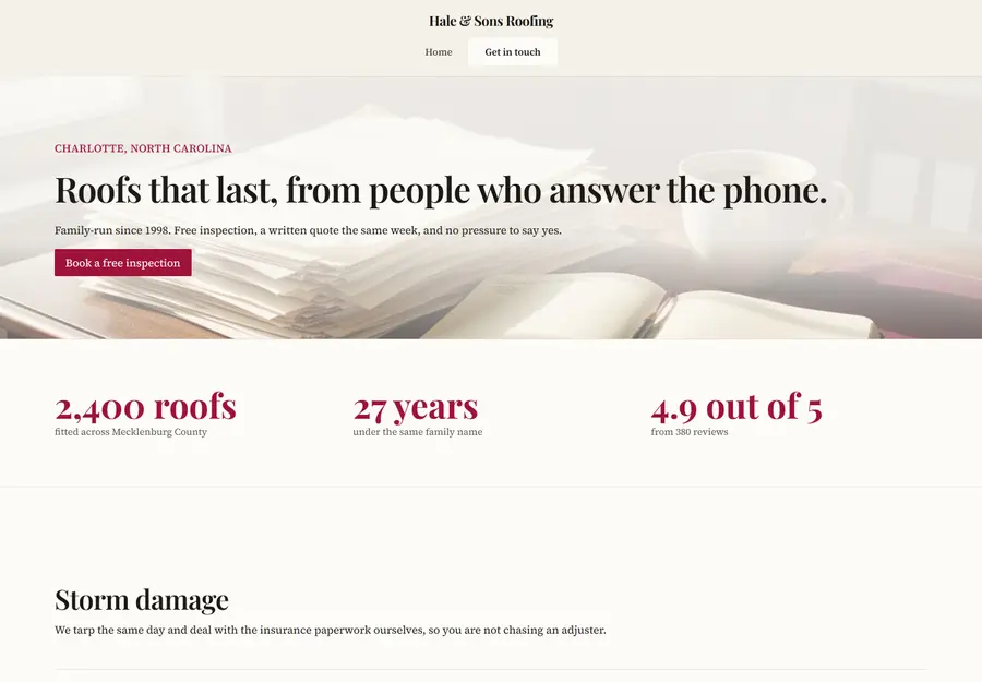
Newsroom
Sites that are mostly writing — a blog, a practice, anyone who publishes
- Serif headings and serif body — built for reading, not scanning
- The largest text of any theme, and the widest steps between headings
- A warm paper ground that is easier on the eye than white
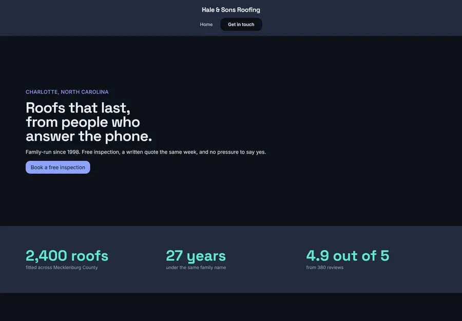
Aurora
Work that looks better against dark — photographers, studios, bars, venues
- The only dark theme: a deep ground with warm off-white words
- Colours picked against the dark rather than inverted from a light theme
- Space Grotesk headings over Inter — modern without being cold
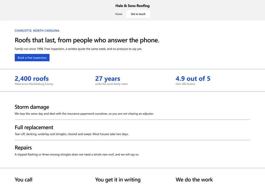
Bedrock
Sites where being readable and being fast matter more than looking designed
- The highest contrast a screen can show — black on white, 21:1
- No typeface to download: the words appear with the page
- Nothing moves, anywhere, for anybody
In the works
Looks we would build to order.
None of these exists yet — they are looks for particular trades that we would draw for a client who wanted one, which is why they are kept apart from the six above. Filter by what you are building.
No themes match that filter yet.
Not sure which theme fits your brand?
Tell us what you're building and we'll recommend the closest starting point.